How diversification provides less risky returns
Spreading The Risk
Currently the markets are in a state of flux-economic data is appalling but that’s to be expected given that much of the world has been in lockdown. Stock-markets have rallied from the lows but need more certainty to push ahead, and there’s a general expectation that a second wave of Covid-19 will presage a move lower. So, I thought that it would be more useful to talk a little about how we use diversification to reduce risk.
We often talk of how we seek to build robust portfolios by using a selection of funds with exposure to different assets like shares, bonds, commodities and property to diversify risk; the theory is that different asset groups don’t all rise and fall at the same time.
Whilst (recent) history shows that at times the benefits of diversification are quite low (when a dash for cash sees all prices fall), the idea is that over time such a portfolio will produce better returns with a lower level of risk.
Below is a Scatter Chart which plots returns against the amount of risk taken to produce that return. The chart features our popular Risk 5 Income model and shows the top funds held by percentage, together with the portfolio as a whole (E) and its comparative benchmark (H).

*Annualised percentage returns and volatility over the period since the portfolio started in 2012.
The chart shows the higher returns produced by the Vanguard US Equity (A) and Jupiter Japan Equity (B) funds, but also the higher volatility (falls and rises in fund price). By contrast, the Jupiter Strategic Bond fund (F) provided lower returns but far less volatility; its fund price, if not predictable, stays within a tighter range. The Jupiter Strategic Bond fund also represents a few other bond funds in the portfolio as the chart restricts the number of funds we can show.
Drawing all this together, the key blocks are (E), the Risk 5 Income portfolio, and (H), the benchmark. The chart shows that our Risk 5 portfolio has, since inception, produced an additional 1.8% annualised return over benchmark but with lower volatility.
FE Analytics, the software that we use in analyzing funds and our portfolios, shows a 24% reduction in risk due to the diversification benefit on the Risk 5 Income fund.
The table below shows the top 5 asset categories by weighting, but doesn’t include significant diversifiers like the gold and infrastructure funds.

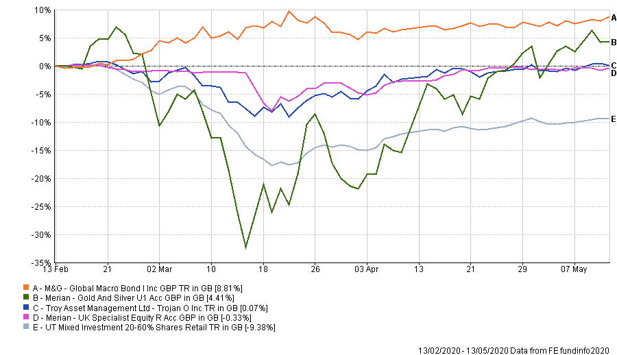
At a time when some of our equity funds, particularly in the UK, have taken a heavy hit, some of our diversifiers have held up well with a couple even rising in price. The following chart deliberately concentrates on these more positive examples, comparing their recent performance to the benchmark.

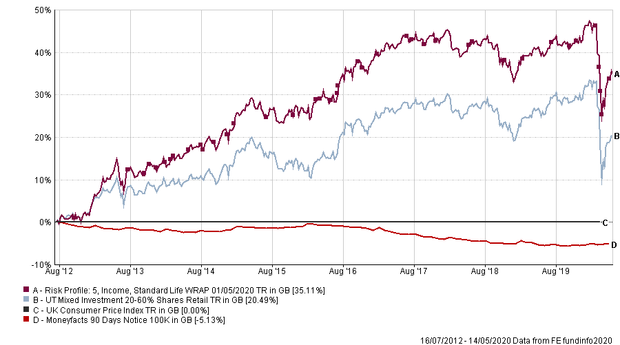
One final thought on risk, that of being invested (very topical at the moment); perhaps there’s a greater risk in not being invested. The final chart plots our portfolio, the benchmark and the MoneyFacts 90-day Notice (as a proxy for a decent cash account) relative to inflation; so, inflation (CPI ) is fixed at 0 and the other lines show by how much they have out-performed, or under-performed, inflation.

Since 2012 the 90-day Cash account has failed to keep up with the cost of living, whereas our portfolio, even after the recent collapse, has produced a total return of 35% more than inflation. However, despite having shown how poorly cash performs over the longer term, we’re not averse to raising cash levels tactically in the short term, and we have used the recent stock-market rally to take cash levels a bit higher so that we’re well-equipped to take advantage of opportunities over the next few months.
Past performance is no guide to future returns, but I hope this post provides some re-assurance that over the longer term a well-diversified portfolio is still the best answer.
Stay Safe

